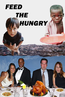
In our great nation there are children going to bed hungry every night. Without a healthy diet children can not reach their potential. Hungry children are not happy, they are sad most times and suffer with stomach and other medical problems. When children go to school hungry they may not perform well academically. When we are having a nice dinner with our family or friends remember there are people that are less fortunate than you are. Reach out to help a hungry child.
To create this poster, 'Feed the Hungry,' I downloaded images from photobucket, and inserted the couples, a blue sky, turkey, garbage, the boy with the plate and the smaller boy. I duplicated the soup and the desert. I added smears to the small boy's face and brighten the complexion of the black boy. I used the lasso and quick selection tools to clean up selections. I enlarged the images to clean the edges. I erased a sliver bowl, knives and forks from the table. I used the layers panel to make layers of the each image. Using the spot healing tool to make corrections on the white table cloth, I also used the smudge tool to smudge the white color. And to repair the plate edge and to add to his body. To smooth the edges on the image I used the blur tool. I also used the clone stamp tool for corrections. I used the gradient tool to blend the two layers but didn't like the effect wth this poster. I converted the layers to grayscale using the adjustments panel but the garbage and food images look best in color. I use the I enjoy photoshop but I am still struggling.
This is a good poster with a good topic. It conveys the message of hunger with the happy feasting people on the bottom vs the sad hungry children on top. One suggestion I would make is to resize your images before you bring them into your main project. This will reduce the grainy look(ex. the boy with the plate). This can be done by going to "Image" --> "Image Size". Change the resolution to match your main project's resolution. Then adjust the height and width to get it close to what you want in the main project. You say you are still struggling, but it looks like you are getting the hang of it.
ReplyDelete