I had to recreate another book cover, I wasn't happy with , the Nelson Mandala Cover. Harriet The Spy was written and Illustrated by Louise Fitzhugh. The original book had a cartoon design with red, white and yellow text. I think my design is better, the position of the images look and feel like there's some clandestine activity about to take place. I downloaded images from photobucket. I saved the images at 72 dpi, width at 8.5 and height at 11 inches. Using the quick selection tool , I select and separated the image from the background.I choose an outdoor background because I want to put the image Harriet in a position that would tell the reader at a glance that the book was about undercover conduct. I enhanced the images color using the hue and saturation in the adjustment panel. Using the smudge tool I reshape the sitting image arm and used the eraser tool, and blur tool to smooth and clean up the edges. I Used the curve adjustment layer to lighten the midtones. In the design panel I chose the outer glow effect. I use the Comic Sans MS text for the title and Times New Roman for the author/illustrator's name..
Thursday, March 31, 2011
Sunday, March 27, 2011
Book Cover Mandela
I chose a book cover designed by Pete Gareau, Mandela. The original cover had a close up image of Nelson mandela face over a light gray background. The original picture was fine but shown a man he had made it through a painful time in his life in his face. I substituted a picture that expressing a Mandela of change and a Mandela representing a promising future. A man who is a beacon light of hope for so many image is bigger than life and I feel the picture I used expressed that.
Nelson Mandela known as the father of Africa, became an international symbol against apartheid. He gave up his freedom, spenting 27 years in prison for opposing apartheid. He became the first President of a black majority ruled South Africa in 1994-1999 and won a Nobel Peace Prize 1993.
The width of the page is 8.5 and the height is 11 inches, the resolution is 300 dpi but also saved at 72 dpi. I used the bucket tool to fill the background color with a pastel pink. I chose the pink to contrast the harshness of apartheid. using the horizontal type tool, I chose the Kokila text for the words apartheid. On the layer panel under the general blending I set the opacity to 16 percent, giving slight transparency. On the edit panel I rotated each apartheid text. I use incised 901 text for the Nelson Mandela's name in black. In the blending panel I used the following effects, drop shadow, bevel and emboss, satin and stroke. I download Mandela's image from Photobucket. Using the quick selection tool I separated the image from the background. And use the eraser tool to clean up the edges. On the adjustment panel under transform I chose to rotate the apartheid texts. On the image panel, under adjustment I chose to lighten up the image.
Friday, March 25, 2011
Saturday, March 12, 2011
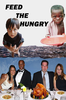
Feed the Hungry
In our great nation there are children going to bed hungry every night. Without a healthy diet children can not reach their potential. Hungry children are not happy, they are sad most times and suffer with stomach and other medical problems. When children go to school hungry they may not perform well academically. When we are having a nice dinner with our family or friends remember there are people that are less fortunate than you are. Reach out to help a hungry child.
To create this poster, 'Feed the Hungry,' I downloaded images from photobucket, and inserted the couples, a blue sky, turkey, garbage, the boy with the plate and the smaller boy. I duplicated the soup and the desert. I added smears to the small boy's face and brighten the complexion of the black boy. I used the lasso and quick selection tools to clean up selections. I enlarged the images to clean the edges. I erased a sliver bowl, knives and forks from the table. I used the layers panel to make layers of the each image. Using the spot healing tool to make corrections on the white table cloth, I also used the smudge tool to smudge the white color. And to repair the plate edge and to add to his body. To smooth the edges on the image I used the blur tool. I also used the clone stamp tool for corrections. I used the gradient tool to blend the two layers but didn't like the effect wth this poster. I converted the layers to grayscale using the adjustments panel but the garbage and food images look best in color. I use the I enjoy photoshop but I am still struggling.
Monday, February 7, 2011
IS THIS THEIR FUTURE, this is a photomontage about the future of generations to come. Will there be a future? And what kind of future will it be? And how the many oil spills will adversely affect their future. This photomontage is the pasting of a child image, and the oil soaked duck on a background of oil spilled water. These images further illustrate how the pollution of our waters will be the key to the annihilation of life on earth.
I scanned through Photobucket for pictures and found the child, duck and the polluted ocean background. I use the smudge tool to blur the color in specify places on the water. I added an oil image and positioned the duck on top of it. The blue and gray title was created using the character and style panels. I used the blending options panel to add a black outline around the text. I used the following tools to edit my montage from the tools panel: the move, quick selection, lasso, crop, eyedropper, brush, eraser,clone stamp, blur, smudge, text horizontal type, object rotate, the masks panel, layers comps panel, and history panel.
Tuesday, February 1, 2011
Monday, January 31, 2011
Subscribe to:
Posts (Atom)